Data simulation and propensity score estimation
In this post, I will play around with simulated data. The things I’ll be doing:
- Simulating my own dataset with null associations between two different exposures (
x1andx2) and outcomesy1andy2for each of exposures (4 exposure-outcome pairs) - Computing propensity scores (PS) for each exposure, trimming non-overlapping areas of PS distribution between exposed and unexposed
- Running several logistic regression models
- Crude
- Conventionally adjusted
- Adjusted with standardized mortality ratio (SMR) weighting using PS
- Calculating how biased the the estimates are compared with the true (null) effect
Data simulation
First, I simulate the data for 10 confounders c1-c10, 2 exposures x1 and x2 (with 7% and 20% prevalences, respectively), 2 outcomes (y1 and y2), two exposure predictors c11-c12, and 2 predictors of the outcome c13-c14. The post is inspired by Desai et al. 2017 paper.
set.seed(08032021)

# simulate data size
n = 2e4

# create 10 confounders
c1 <- rbinom(n, size = 1, prob = 0.052)
c2 <- rbinom(n, size = 1, prob = 0.03)
c3 <- rbinom(n, size = 1, prob = 0.042)
c4 <- rbinom(n, size = 1, prob = 0.025)
c5 <- rbinom(n, size = 1, prob = 0.038)
c6 <- rbinom(n, size = 1, prob = 0.053)
c7 <- rbinom(n, size = 1, prob = 0.077)
c8 <- rbinom(n, size = 1, prob = 0.017)
c9 <- rbinom(n, size = 1, prob = 0.043)
c10 <- rnorm(n = n, mean = 32, sd = 7)

# treatment determinant only
c11 <- rbinom(n, size = 1, prob = 0.2)
c12 <- rbinom(n, size = 1, prob = 0.12)

# outcome determinant only
c13 <- rbinom(n, size = 1, prob = 0.27)
c14 <- rbinom(n, size = 1, prob = 0.09)

# A binary exposure variable
a1 <- -5.05
a2 <- -4.18

# Predict the probability of the exposures x1 and x2 using 10 confounders and two exposure determinants (c1–c12)

x1 <- rbinom(n, size = 1, prob = locfit::expit(a1 + 0.34*c1 + 0.29*c2 + 2.96*c3 + 0.4*c4 + 0.13*c5 + 1.51*c6 + 1.69*c7 + 1.10*c8 + 0.23*c9 + 0.05*c10 + 0.4*c11 + 0.3*c12))

x2 <- rbinom(n, size = 1, prob = locfit::expit(a2 + 0.10*c1 + 0.30*c2 + 1.05*c3 + 0.45*c4 + 0.24*c5 + 0.13*c6 + 2.05*c7 + 0.19*c8 + 0.3*c9 + 0.07*c10 + 0.6*c11 + 0.1*c12))

# A binary outcome variable is simulated using c1-c10 confounders and outcome predictors. The null exposure effect: x variables are not used to simulate the outcomes

b1 <- -3.15
b2 <- -2.1

y1 <- rbinom(n = n, size = 1, prob = locfit::expit(b1 + 0.12*c1 + 0.06*c2 + 0.09*c3 + 0.10*c4 + 0.15*c5 + 0.3*c6 + 0.11*c7 + 0.1786*c8 + 0.5924*c9 + 0.002*c10 + 0.4*c13 + 0.5*c14))

y2 <- rbinom(n = n, size = 1, prob = locfit::expit(b2 + 0.24*c1 + 0.07*c2 + 0.09*c3 + 0.13*c4 + 0.52*c5 + 0.26*c6 + 0.17*c7 + 0.86*c8 + 0.29*c9 + 0.01*c10 + 0.009*c13 + 0.1*c14))

# assemble the dataset
data <- data_frame(c1, c2, c3, c4, c5, c6, c7, c8, c9, c10, c11, c12, c13, c14, x1, x2, y1, y2)
## Warning: `data_frame()` was deprecated in tibble 1.1.0.
## Please use `tibble()` instead.
skimr::skim(data)
Table: Table 1: Data summary
| Name | data |
| Number of rows | 20000 |
| Number of columns | 18 |
| _______________________ | |
| Column type frequency: | |
| numeric | 18 |
| ________________________ | |
| Group variables | None |
Variable type: numeric
| skim_variable | n_missing | complete_rate | mean | sd | p0 | p25 | p50 | p75 | p100 | hist |
|---|---|---|---|---|---|---|---|---|---|---|
| c1 | 0 | 1 | 0.06 | 0.23 | 0.00 | 0.00 | 0.00 | 0.00 | 1.00 | ▇▁▁▁▁ |
| c2 | 0 | 1 | 0.03 | 0.17 | 0.00 | 0.00 | 0.00 | 0.00 | 1.00 | ▇▁▁▁▁ |
| c3 | 0 | 1 | 0.04 | 0.20 | 0.00 | 0.00 | 0.00 | 0.00 | 1.00 | ▇▁▁▁▁ |
| c4 | 0 | 1 | 0.03 | 0.16 | 0.00 | 0.00 | 0.00 | 0.00 | 1.00 | ▇▁▁▁▁ |
| c5 | 0 | 1 | 0.04 | 0.20 | 0.00 | 0.00 | 0.00 | 0.00 | 1.00 | ▇▁▁▁▁ |
| c6 | 0 | 1 | 0.05 | 0.22 | 0.00 | 0.00 | 0.00 | 0.00 | 1.00 | ▇▁▁▁▁ |
| c7 | 0 | 1 | 0.08 | 0.26 | 0.00 | 0.00 | 0.00 | 0.00 | 1.00 | ▇▁▁▁▁ |
| c8 | 0 | 1 | 0.02 | 0.13 | 0.00 | 0.00 | 0.00 | 0.00 | 1.00 | ▇▁▁▁▁ |
| c9 | 0 | 1 | 0.04 | 0.20 | 0.00 | 0.00 | 0.00 | 0.00 | 1.00 | ▇▁▁▁▁ |
| c10 | 0 | 1 | 32.04 | 6.97 | 5.42 | 27.34 | 32.07 | 36.81 | 59.52 | ▁▃▇▃▁ |
| c11 | 0 | 1 | 0.20 | 0.40 | 0.00 | 0.00 | 0.00 | 0.00 | 1.00 | ▇▁▁▁▂ |
| c12 | 0 | 1 | 0.12 | 0.32 | 0.00 | 0.00 | 0.00 | 0.00 | 1.00 | ▇▁▁▁▁ |
| c13 | 0 | 1 | 0.26 | 0.44 | 0.00 | 0.00 | 0.00 | 1.00 | 1.00 | ▇▁▁▁▃ |
| c14 | 0 | 1 | 0.09 | 0.28 | 0.00 | 0.00 | 0.00 | 0.00 | 1.00 | ▇▁▁▁▁ |
| x1 | 0 | 1 | 0.08 | 0.26 | 0.00 | 0.00 | 0.00 | 0.00 | 1.00 | ▇▁▁▁▁ |
| x2 | 0 | 1 | 0.20 | 0.40 | 0.00 | 0.00 | 0.00 | 0.00 | 1.00 | ▇▁▁▁▂ |
| y1 | 0 | 1 | 0.06 | 0.23 | 0.00 | 0.00 | 0.00 | 0.00 | 1.00 | ▇▁▁▁▁ |
| y2 | 0 | 1 | 0.15 | 0.36 | 0.00 | 0.00 | 0.00 | 0.00 | 1.00 | ▇▁▁▁▂ |
Creating two separate datasets: one for each exposure
# mutate confounders to factor variables for easier readability by humans :)
data %<>%
  mutate_at(c("c1", "c2", "c3", "c4", "c5", "c6", "c7", "c8", "c9", "c11", "c12", "c13", "c14", "y1", "y2", "x1", "x2"), ~ as_factor(.)
  )

data1 <- data %>% select(-c(x2), x = x1)
data2 <- data %>% select(-c(x1), x = x2)
Checking the variables distributions
data1 %>%
  group_by(x) %>%
  furniture::table1(.) %>%
  as_tibble() %>%
  ungroup() %>%
  rename("x" = 1, "x=0" = 2, "x=1" = 3) %>%
  mutate_all(~stringr::str_trim(., side = "both")) %>%
  filter(x != "0") %>%
  kableExtra::kable()
## Using dplyr::group_by() groups: x
| x | x=0 | x=1 |
|---|---|---|
| n = 18499 | n = 1501 | |
| c1 | ||
| 1 | 1001 (5.4%) | 102 (6.8%) |
| c2 | ||
| 1 | 536 (2.9%) | 45 (3%) |
| c3 | ||
| 1 | 428 (2.3%) | 384 (25.6%) |
| c4 | ||
| 1 | 455 (2.5%) | 49 (3.3%) |
| c5 | ||
| 1 | 743 (4%) | 66 (4.4%) |
| c6 | ||
| 1 | 850 (4.6%) | 208 (13.9%) |
| c7 | ||
| 1 | 1174 (6.3%) | 344 (22.9%) |
| c8 | ||
| 1 | 273 (1.5%) | 56 (3.7%) |
| c9 | ||
| 1 | 781 (4.2%) | 74 (4.9%) |
| c10 | ||
| 31.9 (7.0) | 33.8 (6.8) | |
| c11 | ||
| 1 | 3548 (19.2%) | 407 (27.1%) |
| c12 | ||
| 1 | 2176 (11.8%) | 219 (14.6%) |
| c13 | ||
| 1 | 4882 (26.4%) | 416 (27.7%) |
| c14 | ||
| 1 | 1600 (8.6%) | 148 (9.9%) |
| y1 | ||
| 1 | 1041 (5.6%) | 86 (5.7%) |
| y2 | ||
| 1 | 2850 (15.4%) | 242 (16.1%) |
data2 %>%
  group_by(x) %>%
  furniture::table1(.) %>%
  as_tibble() %>%
  ungroup() %>%
  rename("x" = 1, "x=0" = 2, "x=1" = 3) %>%
  mutate_all(~stringr::str_trim(., side = "both"))%>%
  filter(x != "0") %>%
  kableExtra::kable()
## Using dplyr::group_by() groups: x
| x | x=0 | x=1 |
|---|---|---|
| n = 15973 | n = 4027 | |
| c1 | ||
| 1 | 859 (5.4%) | 244 (6.1%) |
| c2 | ||
| 1 | 437 (2.7%) | 144 (3.6%) |
| c3 | ||
| 1 | 521 (3.3%) | 291 (7.2%) |
| c4 | ||
| 1 | 355 (2.2%) | 149 (3.7%) |
| c5 | ||
| 1 | 610 (3.8%) | 199 (4.9%) |
| c6 | ||
| 1 | 835 (5.2%) | 223 (5.5%) |
| c7 | ||
| 1 | 620 (3.9%) | 898 (22.3%) |
| c8 | ||
| 1 | 262 (1.6%) | 67 (1.7%) |
| c9 | ||
| 1 | 634 (4%) | 221 (5.5%) |
| c10 | ||
| 31.4 (6.9) | 34.4 (6.8) | |
| c11 | ||
| 1 | 2860 (17.9%) | 1095 (27.2%) |
| c12 | ||
| 1 | 1872 (11.7%) | 523 (13%) |
| c13 | ||
| 1 | 4216 (26.4%) | 1082 (26.9%) |
| c14 | ||
| 1 | 1393 (8.7%) | 355 (8.8%) |
| y1 | ||
| 1 | 876 (5.5%) | 251 (6.2%) |
| y2 | ||
| 1 | 2436 (15.3%) | 656 (16.3%) |
Making a nested dataframe to run models for each dataset in the nested dataframe.
# make a nested dataset

nested <- enframe(x = list(data1, data2), name = "dataset") %>%
  rename(data = "value")

nested %<>% mutate(
  dataset = c("Pr(x) = 0.07", "Pr(x) = 0.20"),
  prevalence_exposure = c(0.07, 0.20),
  p_x_glm_model = map(data, ~ glm(data = .x, family = binomial(link = "logit"), formula = x ~ 1)),
  p_x = map(p_x_glm_model, ~predict(.x, type = "response")),
  data = map2(data, p_x, ~mutate(.x,
                           p_x = .y)))
I run crude analyses for the association between x and y1 & x and y2 for each different x; then I compute 95% confidence intervals (CIs) using bootstrap for each of the crude analyses.
# crude analyses
set.seed(19052020)

# simple functions for crude logistic regressions of x on y
fit_crude_y1 <- function(split) {
    glm(data = split, family = binomial(link = "logit"), formula = y1 ~ x)
}

fit_crude_y2 <- function(split) {
    glm(data = split, family = binomial(link = "logit"), formula = y2 ~ x)
}

# run the bootstraps and the crude models
nested %<>% mutate(

  boots = map(data, ~rsample::bootstraps(.x, times = 1e3, apparent = TRUE)),

  boot_models_y1 = map(boots, ~mutate(.x,
                                   model_y1 = map(splits, ~fit_crude_y1(split = .x)),
                                   coef_info = map(model_y1, ~broom::tidy(.x, exponentiate = T)))
                       ),

  boot_models_y2 = map(boots, ~mutate(.x,
                                   model_y2 = map(splits, ~fit_crude_y2(split = .x)),
                                   coef_info = map(model_y2, ~broom::tidy(.x, exponentiate = T)))
                       ),
  # extract coefficients and create 95% confidence intervals using percentile method
  boot_coefs_y1 = map(boot_models_y1, ~unnest(.x, coef_info)),
  boot_coefs_y2 = map(boot_models_y2, ~unnest(.x, coef_info)),
  percentile_intervals_y1 = map(boot_models_y1, ~int_pctl(.x, coef_info)),
  percentile_intervals_y2 = map(boot_models_y2, ~int_pctl(.x, coef_info))
)
I extract the results of the crude analyses for two datasets capturing two different exposures and two different outcomes for each exposure.
results_crude <- nested %>%
  select(dataset, prevalence_exposure, percentile_intervals_y1, percentile_intervals_y2) %>%
  pivot_longer(cols = c(3, 4), names_to = "outcome", values_to = "percentile_intervals") %>%
  unnest_legacy() %>%
  mutate(outcome = str_extract(outcome, pattern = "y\\d+$")) %>%
  filter(term == "x1") %>%
  # pct bias on odds ratio (OR) scale
  # confidence limit ration (CLR)
  mutate(
    pct_bias = (.estimate - 1) * 100,
    clr = .upper/.lower
  )
I create a color palette from a picture I saw online. Thanks to colorfindr package for making this possible.
# make a palette
palette_ps <- colorfindr::get_colors("http://wisetoast.com/wp-content/uploads/2015/10/The-Persistence-of-Memory-salvador-deli-painting.jpg") %>%
  colorfindr::make_palette(n = 10)
## Warning: Quick-TRANSfer stage steps exceeded maximum (= 23600600)

I plot the estimates and bootstrapped 95% CIs for the sets of two exposures and outcomes y1 and y2 to visually assess the results. I know that in simulated data there is null true effect of both exposures on the outcomes y1 and y2. I suspect that the results of the crude analyses would be biased.
p1 <- results_crude %>%
  ggplot(aes(x = as_factor(prevalence_exposure), y = .estimate, color = outcome, fill = outcome, shape = outcome, group = outcome)) +
  geom_hline(yintercept = 1, color = "#617E7C") +
  geom_errorbar(aes(ymin=.lower, ymax = .upper), width = 0.2, position = position_dodge(width = 0.3)) +
  geom_point(position = position_dodge(width = 0.3)) +
  coord_flip() +
  theme_light() +
  scale_color_manual(values = palette_ps[c(10, 9)]) +
  scale_fill_manual(values = palette_ps[c(10, 9)]) +
  labs(title = "Crude associations", x = "Exposure prevalence", y = "OR") +
  guides(fill=guide_legend(title = "Outcome"), color = guide_legend(title = "Outcome"), shape=guide_legend(title = "Outcome"))


p2 <- results_crude %>%
  ggplot(aes(x = as_factor(prevalence_exposure), y = pct_bias, color = outcome, fill = outcome, shape = outcome, group = outcome)) +
  scale_y_continuous(limits = c(-20, 20), breaks = seq(-20, 20, 5)) +
  geom_hline(yintercept = 0, color = "#617E7C") +
  geom_point() +
  theme_light() +
  coord_flip() +
  scale_color_manual(values = palette_ps[c(10, 9)]) +
  scale_fill_manual(values = palette_ps[c(10, 9)]) +
  labs(title = "Crude associations", x = "Exposure prevalence", y = "% bias") +
  guides(fill=guide_legend(title = "Outcome"), color = guide_legend(title = "Outcome"), shape = guide_legend(title = "Outcome"))

p1 / p2
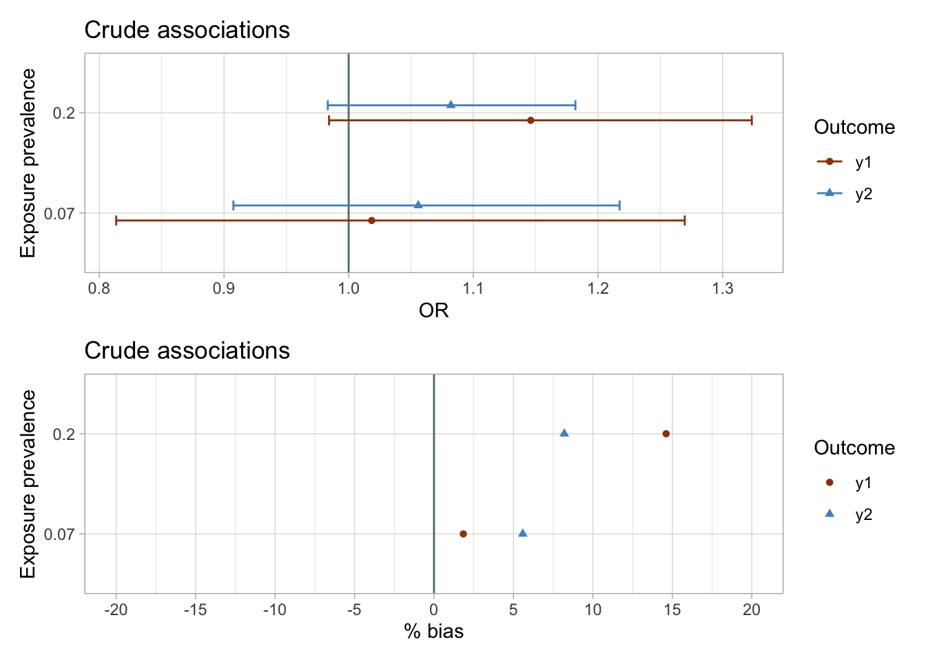
The results of the unadjusted analyses are imprecise and suggest weak associations between exposures and the outcomes.
Propensity score (PS) modeling
# the 10 confounders, c1–c10, & the predictors of the outcome are included in the propensity score models
ps_model <- function(data) glm(data = data, family = binomial(link = "logit"), formula = x ~ c1 + c2 + c3 + c4 + c5 + c6 + c7 + c8 + c9 + c10 + c13 + c14)
nested %<>% mutate(
# fit ps models in each dataset
ps_fit = map(data, ~ ps_model(.x)),
# tidy ps fit
ps_fit_tidy = map(ps_fit, ~broom::tidy(., exponentiate = TRUE, conf.int = TRUE)),
# compute predicted probability of exposure in each dataset
data = map2(ps_fit, data, ~mutate(.y,
p_xc = predict(.x, type = "response")))
)
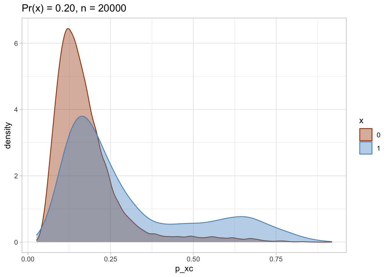
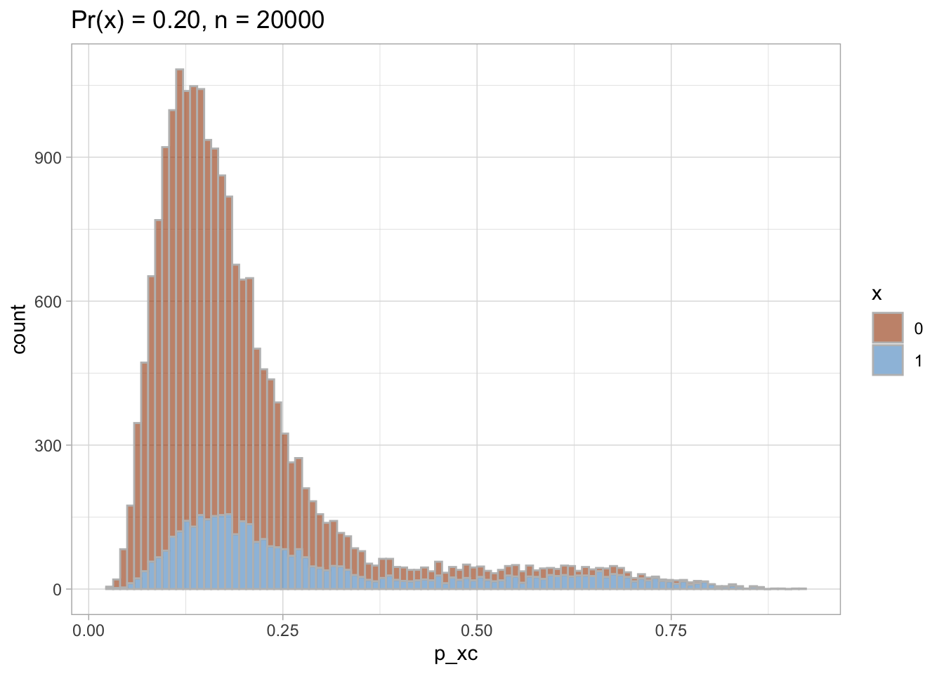
# PS viz
title <- list("Pr(x) = 0.07", "Pr(x) = 0.20")
nested %<>% mutate(
viz_density = map2(data, title, ~ggplot(data = .x, aes(x = p_xc, group = x, color = x, fill = x)) +
geom_density(alpha = 0.4) +
theme_light() +
labs(title = paste0(.y, ", n = ", nrow(.x))) +
scale_color_manual(values = palette_ps[c(10, 9)]) +
scale_fill_manual(values = palette_ps[c(10, 9)])
),
viz_histo = map2(data, title, ~ggplot(data = .x, aes(x = p_xc, group = x, color = x, fill = x)) +
geom_histogram(alpha = 0.6, colour = "grey", bins = 100) +
theme_light() +
labs(title = paste0(.y, ", n = ", nrow(.x))) +
scale_color_manual(values = palette_ps[c(10, 9)]) +
scale_fill_manual(values = palette_ps[c(10, 9)])
)
)
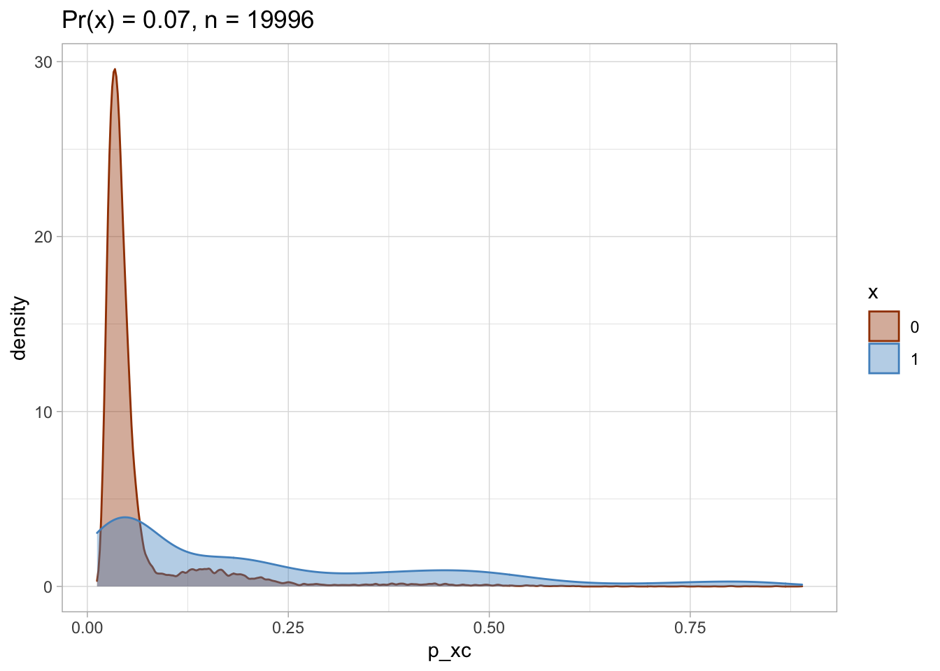
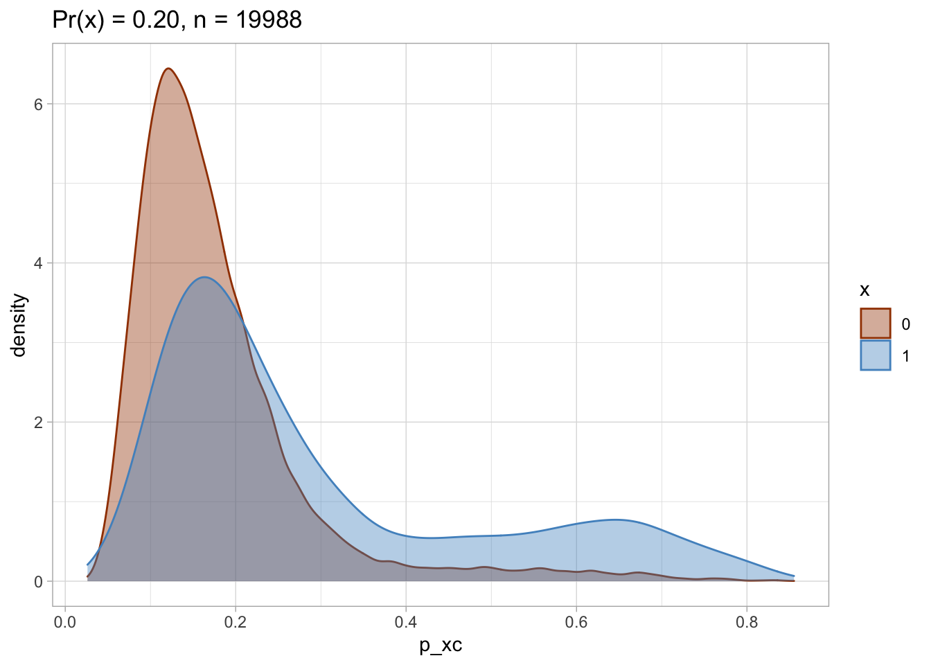
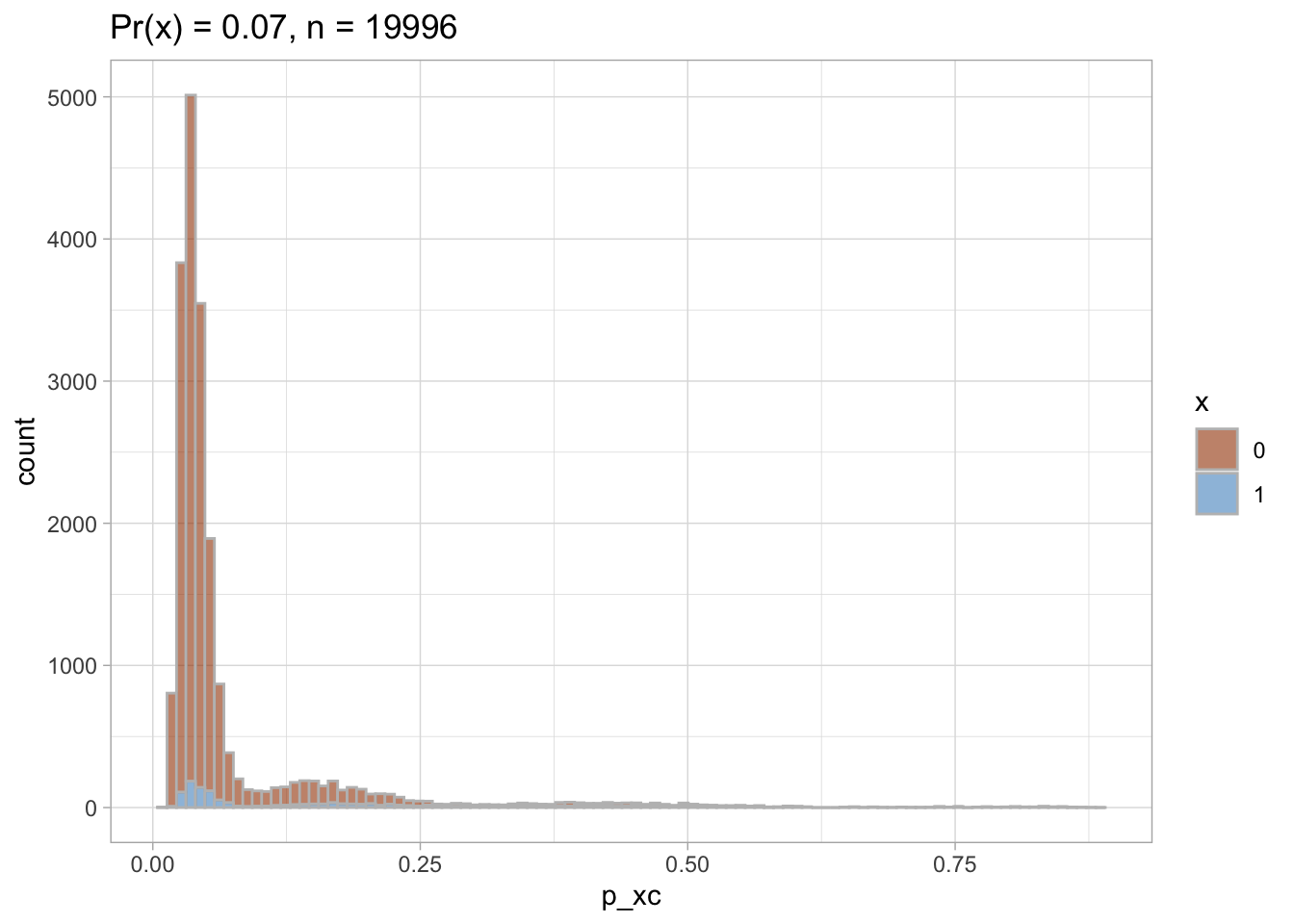
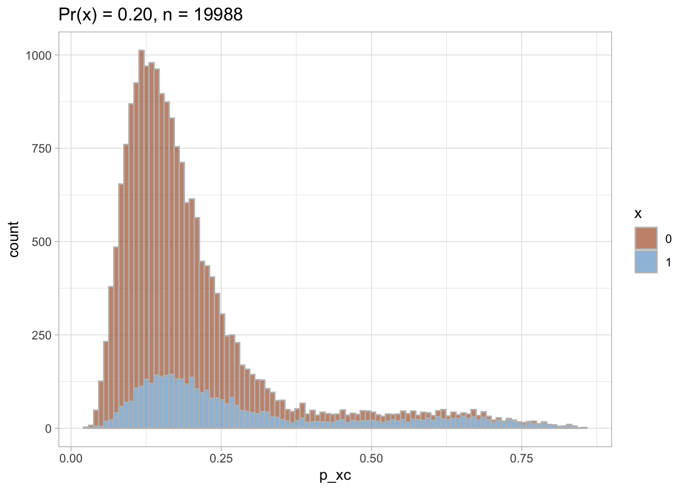
PS density plot and histogram
I plot each PS as a density plot and as a histogram separately for exposed and unexposed.
nested$viz_density
## [[1]]

##
## [[2]]
nested$viz_histo
## [[1]]
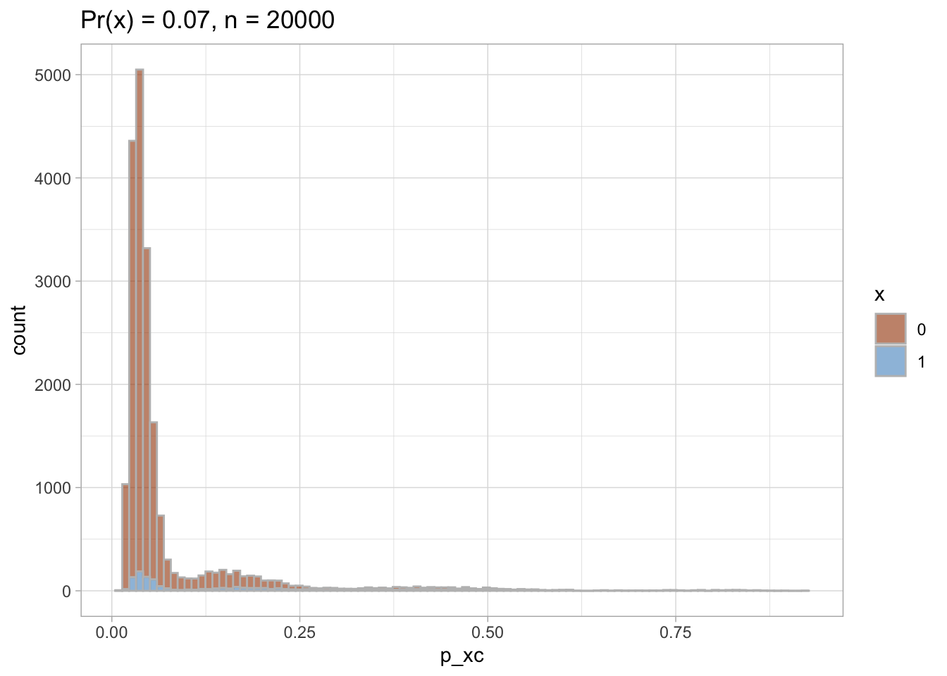
##
## [[2]]
PS trimming
I trim the non-overlapping areas of PS distribution in each of the datasets.
# trim areas of PS non-overlap
nested %<>% mutate(
  data_trimmed = map(data, ~mutate(.x,
                           keep_p_xc = case_when(
                             (p_xc >= min(p_xc[.x$x == 1])) & (p_xc <= max(p_xc[.x$x == 0])) ~ 1,
                             T ~ 0
                           ))  %>%
               filter(keep_p_xc == 1))
)

nested %<>% mutate(
  viz_density_trimmed = map2(data_trimmed, title, ~ggplot(data = .x, aes(x = p_xc, group = x, color = x, fill = x)) +
              geom_density(alpha = 0.4) +
              theme_light() +
              labs(title = paste0(.y,  ", n = ", nrow(.x))) +
              scale_color_manual(values = palette_ps[c(10, 9)]) +
              scale_fill_manual(values = palette_ps[c(10, 9)])
            ),
  viz_histo_trimmed = map2(data_trimmed, title, ~ggplot(data = .x, aes(x = p_xc, group = x, color = x, fill = x)) +
              geom_histogram(alpha = 0.6, colour = "grey", bins = 100) +
              theme_light()  +
              labs(title = paste0(.y,  ", n = ", nrow(.x))) +
              scale_color_manual(values = palette_ps[c(10, 9)]) +
              scale_fill_manual(values = palette_ps[c(10, 9)])
            )

)
Trimmed PS density plot and histogram
Let’s plot the trimmed PS densities and histograms.
nested$viz_density_trimmed
## [[1]]
##
## [[2]]
nested$viz_histo_trimmed
## [[1]]
##
## [[2]]
 ### Standardized mortality ratio (SMR) weights
I compute the standardized mortality ratio (SMR) weights to later use them for re-weighting of the unexposed as if they were exposed.
### Standardized mortality ratio (SMR) weights
I compute the standardized mortality ratio (SMR) weights to later use them for re-weighting of the unexposed as if they were exposed.
nested %<>% mutate(
  ps = map(data_trimmed, ~ ps_model(.x)),
  data_trimmed = map2(ps, data_trimmed, ~mutate(.y,
                         p_xc = predict(.x, type = "response"))),
  data_trimmed = map(.x = data_trimmed,  ~mutate(.x,
                         # SMR weighting: the unexposed patients within the cohort receive weights equal to the ratio of (PS/(1 − PS))
                        smr.w = case_when(
                                   x == 1 ~ 1, # weight in the exposed is 1
                                   TRUE ~ (p_xc)/(1 - p_xc) # weight in the unexposed
     )))
)


# check weights distribution
smr.w_distr <- nested %>%
  select(data_trimmed, dataset) %>%
  mutate(data_trimmed = map(data_trimmed, ~group_by(.x, x) %>%
                      summarise(min = min(smr.w),
                                  mean = mean(smr.w),
                                  max = max(smr.w),
                                  p25 = quantile(smr.w, probs = 0.25),
                                  p50 = quantile(smr.w, probs = 0.5),
                                  p75 = quantile(smr.w, probs = 0.75)
                                  ))) %>%
  unnest_legacy()

smr.w_distr %>% kableExtra::kable()
| dataset | x | min | mean | max | p25 | p50 | p75 |
|---|---|---|---|---|---|---|---|
| Pr(x) = 0.07 | 0 | 0.0123614 | 0.0815847 | 7.995338 | 0.0321953 | 0.0413382 | 0.0563997 |
| Pr(x) = 0.07 | 1 | 1.0000000 | 1.0000000 | 1.000000 | 1.0000000 | 1.0000000 | 1.0000000 |
| Pr(x) = 0.20 | 0 | 0.0283421 | 0.2510004 | 5.832439 | 0.1265022 | 0.1787239 | 0.2615828 |
| Pr(x) = 0.20 | 1 | 1.0000000 | 1.0000000 | 1.000000 | 1.0000000 | 1.0000000 | 1.0000000 |
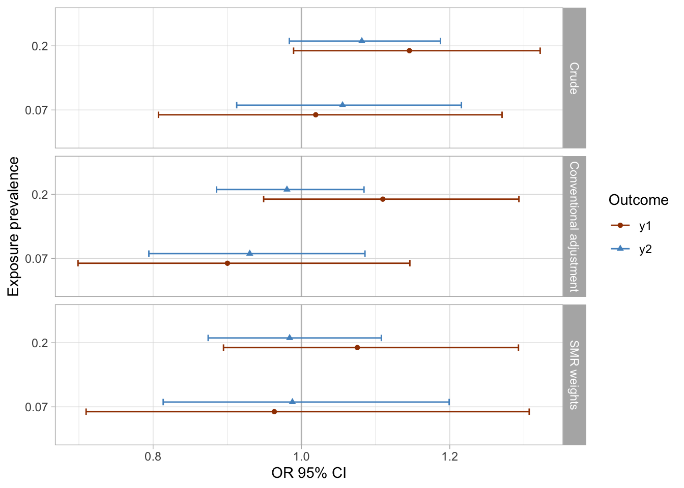
Results
For simplicity, I drop the bootstrapping for 95% CIs computation in the next part of the analyses. I compare how the results of different modeling approaches vary and whether they are able to close to the true null effect I simulated.
# CIs are not bootstrapped
nested %<>% mutate(
  # crude
  fit_crude_y1 = map(data, ~glm(data = .x, family = binomial(link = "logit"), formula = y1 ~ x)),
  fit_crude_y1_tidy = map(fit_crude_y1, ~broom::tidy(., exponentiate = TRUE, conf.int = TRUE)),
  fit_crude_y2 = map(data, ~glm(data = .x, family = binomial(link = "logit"), formula = y2 ~ x)),
  fit_crude_y2_tidy = map(fit_crude_y2, ~broom::tidy(., exponentiate = TRUE, conf.int = TRUE)),
  # SMR
  fit_smr.w_y1 = map(data_trimmed, ~glm(data = .x, family = binomial(link = "logit"), formula = y1 ~ x, weights = smr.w)),
  fit_smr.w_y1_tidy = map(fit_smr.w_y1, ~broom::tidy(., exponentiate = TRUE, conf.int = TRUE)),
  fit_smr.w_y2 = map(data_trimmed, ~glm(data = .x, family = binomial(link = "logit"), formula = y2 ~ x, weights = smr.w)),
  fit_smr.w_y2_tidy = map(fit_smr.w_y2, ~broom::tidy(., exponentiate = TRUE, conf.int = TRUE)),
  # conventional adjustment
  fit_aor_y1 = map(data_trimmed, ~glm(data = .x, family = binomial(link = "logit"), formula = y1 ~ x + c1 + c2 + c3 + c4 + c5 + c6 + c7 + c8 + c9 + c10 + c13 + c14)),
  fit_aor_y1_tidy = map(fit_aor_y1, ~broom::tidy(., exponentiate = TRUE, conf.int = TRUE)),
  fit_aor_y2 = map(data_trimmed, ~glm(data = .x, family = binomial(link = "logit"), formula = y2 ~ x + c1 + c2 + c3 + c4 + c5 + c6 + c7 + c8 + c9 + c10 + c13 + c14)),
  fit_aor_y2_tidy = map(fit_aor_y2, ~broom::tidy(., exponentiate = TRUE, conf.int = TRUE))
)
I extract the results of all models and visualize them using preferred colors.
results_1 <- nested %>%
  select(dataset, prevalence_exposure, fit_crude_y1_tidy, fit_crude_y2_tidy, fit_smr.w_y1_tidy, fit_smr.w_y2_tidy, fit_aor_y1_tidy, fit_aor_y2_tidy) %>%
  pivot_longer(c(3:8), names_to = "model", values_to = "results") %>%
  unnest(cols = c(results)) %>%
  filter(term == "x1") %>%
  select(-p.value) %>%
  separate(col = model, into = c("fit", "approach", "outcome", "tidy"), sep = "_", remove = T) %>%
  select(-fit, -tidy) %>%
  # pct bias on OR scale
  # CLR: confidence limit ratio
  mutate(
    pct_bias = (estimate - 1) * 100,
    clr = conf.high/conf.low,
    analysis = row_number()
  )

results_1 %>%
  mutate(
    approach = case_when(approach == "aor" ~ "Conventional adjustment",
                       approach == "crude" ~ "Crude",
                       approach == "smr.w" ~ "SMR weights"),
    approach = factor(approach, levels = rev(c("SMR weights", "Conventional adjustment", "Crude")))
  ) %>%
  ggplot(aes(x = as_factor(prevalence_exposure), y = estimate, color = outcome, fill = outcome, shape = outcome)) +
  geom_hline(yintercept = 1, color = "gray") +
  geom_errorbar(aes(ymin=conf.low, ymax = conf.high), width = 0.2, position = position_dodge(width = 0.3)) +
  geom_point(position = position_dodge(width = 0.3)) +
  coord_flip() +
  facet_grid(rows = vars(approach)) +
  theme_light() +
  scale_color_manual(values = palette_ps[c(10, 9, 4)]) +
  scale_fill_manual(values = palette_ps[c(10, 9, 4)]) +
  labs(x = "Exposure prevalence", y = "OR 95% CI") +
  guides(fill=guide_legend(title = "Outcome"), color = guide_legend(title = "Outcome"), shape = guide_legend(title = "Outcome"))
results_1 %>%
  mutate(
    approach = case_when(approach == "aor" ~ "Conventional adjustment",
                       approach == "crude" ~ "Crude",
                       approach == "smr.w" ~ "SMR weights"),
    approach = factor(approach, levels = rev(c("SMR weights", "Conventional adjustment", "Crude")))
  ) %>%
  ggplot(aes(x = as_factor(prevalence_exposure), y = pct_bias, color = outcome, fill = outcome, shape = outcome, group = outcome)) +
  geom_hline(yintercept = 0, color = "gray") +
  geom_point() +
  facet_grid(rows = vars(approach)) +
  theme_light() +
  coord_flip() +
  scale_y_continuous(limits = c(-20, 20), breaks = seq(-20, 20, 5)) +
  scale_color_manual(values = palette_ps[c(10, 9)]) +
  scale_fill_manual(values = palette_ps[c(10, 9)])+
  labs(x = "Exposure prevalence", y = "% bias") +
  guides(fill=guide_legend(title = "Outcome"), color = guide_legend(title = "Outcome"), shape = guide_legend(title = "Outcome"))
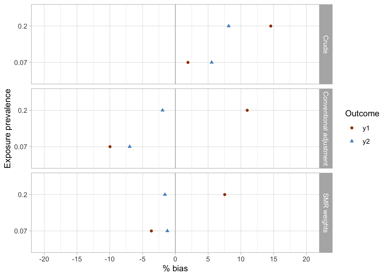
Conclusions
- The crude analyses were imprecise and suggested associations were present between the exposures (
x1,x2) and the outcomes (y1,y2), while there were null true associations (maximum bias in crude analyses was approximately 15%).- The conventional adjustment in the logistic regression model produced imprecise estimates and suggested weak associations, including reverse associations for some exposure-outcome pairs (maximum bias of approximately 11%).
- SMR weighting produced imprecise results and similarly to conventional adjustment suggested some weak inverse associations between exposures and outcomes (maximum bias of approximately 7.5% was observed for the
x2-y1exposure-outcome pair). - Although uncertainty presented an issue in all three analyses, the SMR weighting approach arguably produced the point estimates closest to the true (simulated) null effects.
References
- Desai RJ, Rothman KJ, Bateman BT, Hernandez-Diaz S, Huybrechts KF. A Propensity-score-based Fine Stratification Approach for Confounding Adjustment When Exposure Is Infrequent. Epidemiology. 2017;28(2):249-257. doi:10.1097/EDE.0000000000000595