Income inequality: OECD data
Data
In this post I explore income inequality. The data comes from OECD, where inequality is defined as household disposable income per year. Main income inequality markers I use from the dataset are:
- The Gini coefficient. It is computed as cumulative proportions of the population against cumulative proportions of income they receive. Ranges between 0 for max equality to 1 for max inequality.
- S80/S20 is the ratio of the average income of the 20% richest to the 20% poorest.
- P90/P10 is the ratio of the upper bound value of the 9th decile (10% of people with highest income) to that of the 1st decile (10% of people with lowest income).
Other income inequality markers in the dataset:
- P90/P50 of the upper bound value of the 9th decile to the median income.
- P50/P10 of median income to the upper bound value of the 1st decile.
- The Palma ratio is the proportion of all income received by the top 10% of disposable income of high earners divided by the income received by the 40% of population with the lowest disposable income.
library(tidyverse)
library(magrittr)
library(hermitage)
library(rvest)
library(ggrepel)
# I have the data downloaded locally
data <- read_csv(paste0(path_data, "Income inequality/DP_LIVE_05012022202256580.csv"))
## Rows: 2880 Columns: 8
## ── Column specification ────────────────────────────────────────────────────────
## Delimiter: ","
## chr (6): LOCATION, INDICATOR, SUBJECT, MEASURE, FREQUENCY, Flag Codes
## dbl (2): TIME, Value
##
## ℹ Use `spec()` to retrieve the full column specification for this data.
## ℹ Specify the column types or set `show_col_types = FALSE` to quiet this message.
  # getting an idea on all variables in the dataset
data %>% skimr::skim(.)
Table: Table 1: Data summary
| Name | Piped data |
| Number of rows | 2880 |
| Number of columns | 8 |
| _______________________ | |
| Column type frequency: | |
| character | 6 |
| numeric | 2 |
| ________________________ | |
| Group variables | None |
Variable type: character
| skim_variable | n_missing | complete_rate | min | max | empty | n_unique | whitespace |
|---|---|---|---|---|---|---|---|
| LOCATION | 0 | 1.00 | 3 | 3 | 0 | 44 | 0 |
| INDICATOR | 0 | 1.00 | 10 | 10 | 0 | 1 | 0 |
| SUBJECT | 0 | 1.00 | 4 | 6 | 0 | 6 | 0 |
| MEASURE | 0 | 1.00 | 2 | 4 | 0 | 2 | 0 |
| FREQUENCY | 0 | 1.00 | 1 | 1 | 0 | 1 | 0 |
| Flag Codes | 2862 | 0.01 | 1 | 1 | 0 | 1 | 0 |
Variable type: numeric
| skim_variable | n_missing | complete_rate | mean | sd | p0 | p25 | p50 | p75 | p100 | hist |
|---|---|---|---|---|---|---|---|---|---|---|
| TIME | 0 | 1 | 2010.56 | 7.70 | 1976.00 | 2008.00 | 2012 | 2016.0 | 2020.0 | ▁▁▁▅▇ |
| Value | 0 | 1 | 2.65 | 2.39 | 0.21 | 1.15 | 2 | 3.7 | 33.1 | ▇▁▁▁▁ |
# rename to all variable to lowercase and mutate character vars to factors
data %<>%
  rename_all(., ~str_to_lower(names(data))) %>%
  mutate(across(.cols = c(location, indicator, subject, measure, frequency), .fns = ~as_factor(.)))
The countries are encoded with alpha-3 codes without labels. Luckily, I can scrape a web-table instead of coding the countries names by hand.
url <- "https://www.iban.com/country-codes"

meta <- url %>%
  read_html() %>%
  html_nodes(xpath = '//*[@id="myTable"]') %>%
  html_table() %>%
  bind_cols(.)  %>%
  select(country = Country, alpha_3 = "Alpha-3 code") %>%
  mutate(
    country = str_replace(country, pattern = " \\(.*\\)", ""),
    country = str_replace(country, pattern = " \\[.*\\]", "")
  ) %>%
  right_join(data, by = c("alpha_3" = "location"))
Plots
p <- meta %>%
  filter(subject == "GINI") %>%
  mutate(alpha_3 = fct_reorder(alpha_3, value)) %>%
  group_by(alpha_3) %>%
  arrange(time) %>%
  filter(
    row_number() == 1 | row_number() == n()
  ) %>%
  mutate(
    label = case_when(
      lead(value) - value > 0 ~ "UP",
      lead(value) - value < 0 ~ "DOWN",
      lead(value) == value ~ "NO CHANGE",
      T ~ ""
    )
  ) %>%
  ungroup() %>%
  ggplot(aes(x = country, y = value, color = time, fill = time)) +
  coord_flip() +
  geom_line() +
  geom_point(size = 5, alpha = 0.8) +
  geom_hline(yintercept = 0, color = "#D6B7F6", linetype = "dashed") +
  geom_hline(yintercept = 1, color = "#D6B7F6", linetype = "dashed") +
  scale_y_continuous(limits = c(0, 1)) +
  theme_void(base_size = 17, base_family = "Varela Round") +
  theme(
    plot.background = element_rect(fill = "#F5F0FA"),
    text = element_text(color = "#3E0874"),
    axis.title.y = element_text(margin = margin(1, 1, 1, 1, unit = "lines"), color = "#3E0874", angle = 90),
    axis.title.x = element_text(margin = margin(1, 1, 1, 1, unit = "lines"), color = "#3E0874"),
    axis.text.y = element_text(color = "#3E0874", hjust = 1),
    axis.text.x = element_text(color = "#3E0874"),
    plot.title = element_text(size = 25),
    legend.position = "bottom",
    legend.key.width = unit(3, "cm"),
    legend.box.margin = margin(10, 10, 10, 10),
    panel.spacing = unit(5, "lines"),
    plot.margin = margin(15, 15, 15, 15),
    plot.caption = element_text(hjust = 0)
  ) +
  scale_color_gradientn(colours = RColorBrewer::brewer.pal(name = "Purples", n = 9)) +
  labs(title = "How equal is equal? Gini coefficient", y = "Gini coefficient shows higher value for higher income inequality",
       x = "COUNTRIES",
       caption = "Source | OECD (2022), 'Income inequality' (indicator), https://doi.org/10.1787/459aa7f1-en (accessed on 06 January 2022)\nElena Dudukina | @evpatora") +
  guides(color = guide_colorbar(title = "First-last year of data availability", title.vjust = 1), fill = "none") +
  geom_text(aes(label = "PERFECT INEQUALITY", y = 0.01, x = 20, angle = 90, size = 25), show.legend = FALSE) +
  geom_text(aes(label = "PERFECT EQUALITY", y = 0.99, x = 20, angle = 90, size = 25), show.legend = FALSE) +
  geom_text_repel(mapping = aes(label = label), box.padding = 0.3, nudge_y = 0.055, nudge_x = 0, segment.linetype = 6, direction = "both", hjust = "left", size = 3)

p
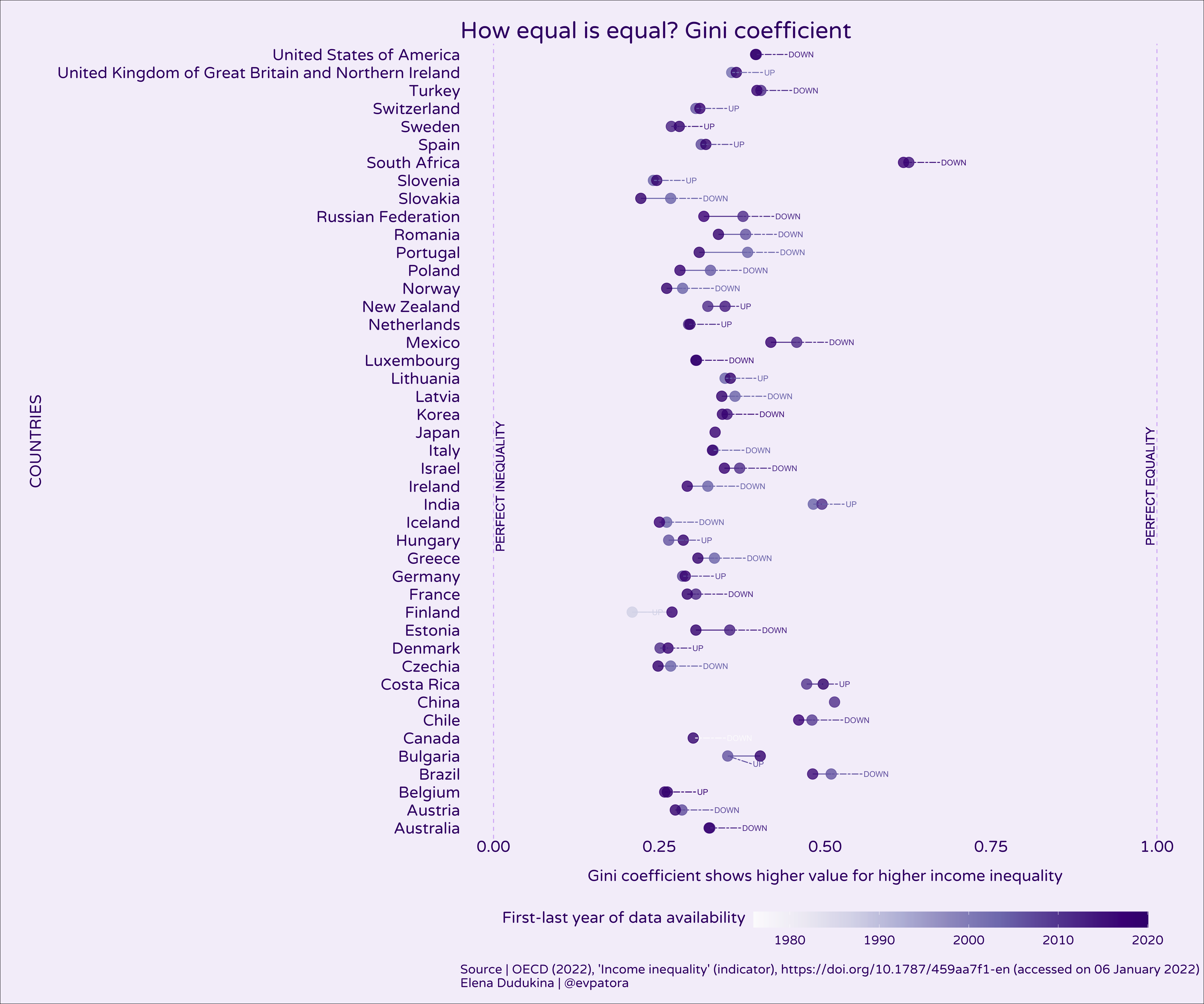
Ignoring disadvantages of Gini coefficient, based on its value several countries improved in terms of income equality over time (eg, Finland, Denmark, Sweden, Iceland), while others did not (eg, US, Russia, Ireland, Greece). However, data availability is inconsistent over time for many countries.
# S80/S20

p <- meta %>%
  filter(subject == "S80S20") %>%
  mutate(alpha_3 = fct_reorder(alpha_3, value)) %>%
  group_by(alpha_3) %>%
  arrange(time) %>%
  filter(
      row_number() == n()
  ) %>%
  ungroup() %>%
  ggplot(aes(x = country, y = value, color = as_factor(time), fill = as_factor(time))) +
  scale_y_continuous(breaks = seq(from = 0, to = 35, by = 5)) +
  coord_flip() +
  geom_point(size = 5, alpha = 0.8) +
  theme_void(base_size = 17, base_family = "Varela Round") +
  theme(
    plot.background = element_rect(fill = "#F5F0FA"),
    text = element_text(color = "#3E0874"),
    axis.title.y = element_text(margin = margin(1, 1, 1, 1, unit = "lines"), color = "#3E0874", angle = 90),
    axis.title.x = element_text(margin = margin(1, 1, 1, 1, unit = "lines"), color = "#3E0874"),
    axis.text.y = element_text(color = "#3E0874", hjust = 1),
    axis.text.x = element_text(color = "#3E0874"),
    plot.title = element_text(size = 25),
    legend.position = "bottom",
    legend.key.width = unit(3, "cm"),
    legend.box.margin = margin(10, 10, 10, 10),
    panel.spacing = unit(5, "lines"),
    plot.margin = margin(15, 15, 15, 15),
    plot.caption = element_text(hjust = 0)
  ) +
  scale_color_manual(values = hermitage_palette(name = "madonna_litta")) +
  scale_fill_manual(values = hermitage_palette(name = "madonna_litta")) +
  labs(title = "How equal is equal?\nAverage income of the 20% richest to the 20% poorest", y = "Inequality, S80/S20",
       x = "COUNTRIES",
       caption = "Source | OECD (2022), 'Income inequality' (indicator), https://doi.org/10.1787/459aa7f1-en (accessed on 06 January 2022)\nElena Dudukina | @evpatora") +
  guides(color = guide_legend(title = "Last year of data availability", title.vjust = 1), fill = guide_legend(title = "Last year of data availability", title.vjust = 1)) +
  geom_text_repel(mapping = aes(label = format(value, digits = 2)), box.padding = 0.3, nudge_y = 0.5, nudge_x = 0, segment.linetype = 6, direction = "x", hjust = "right", size = 3)

p
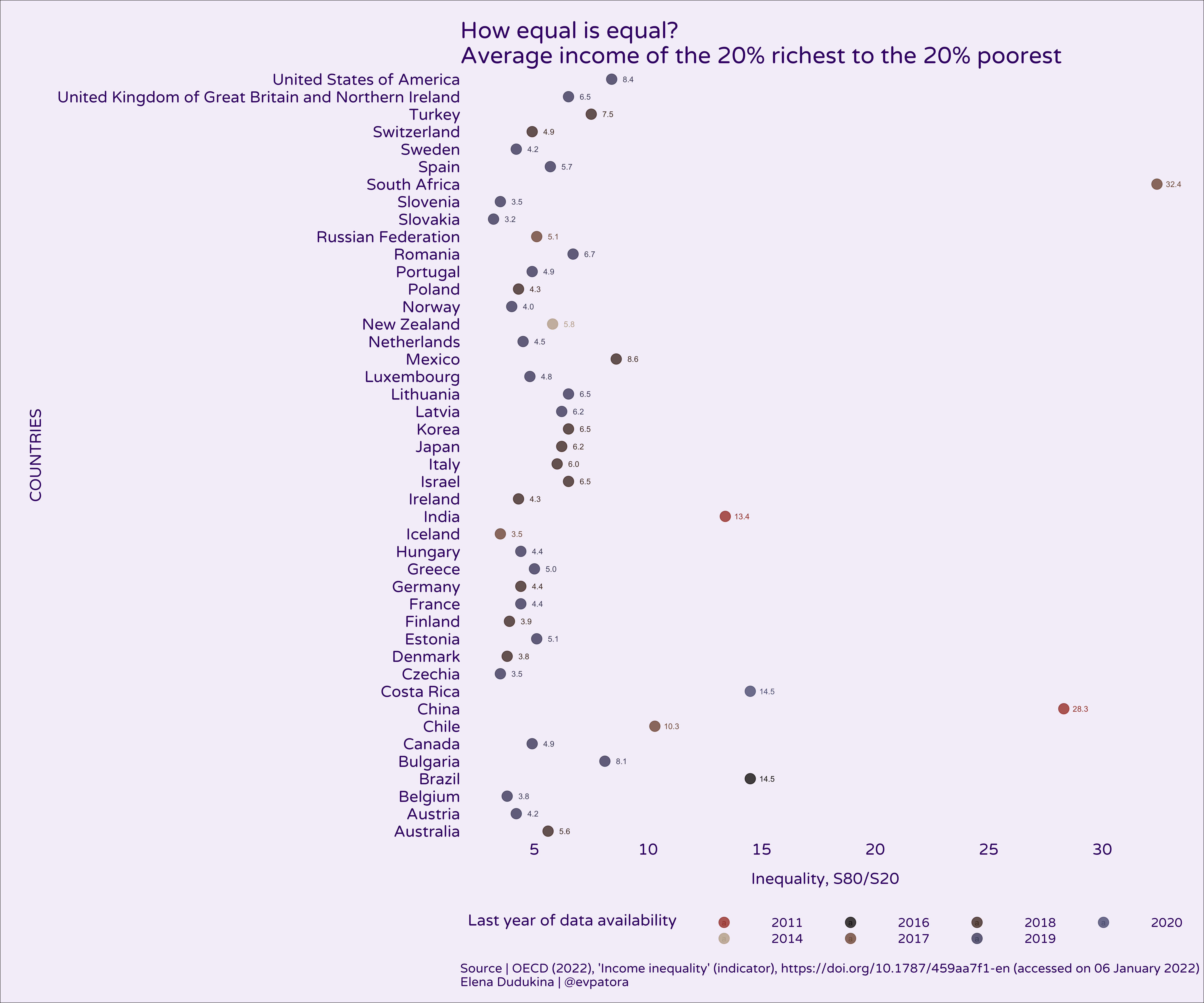
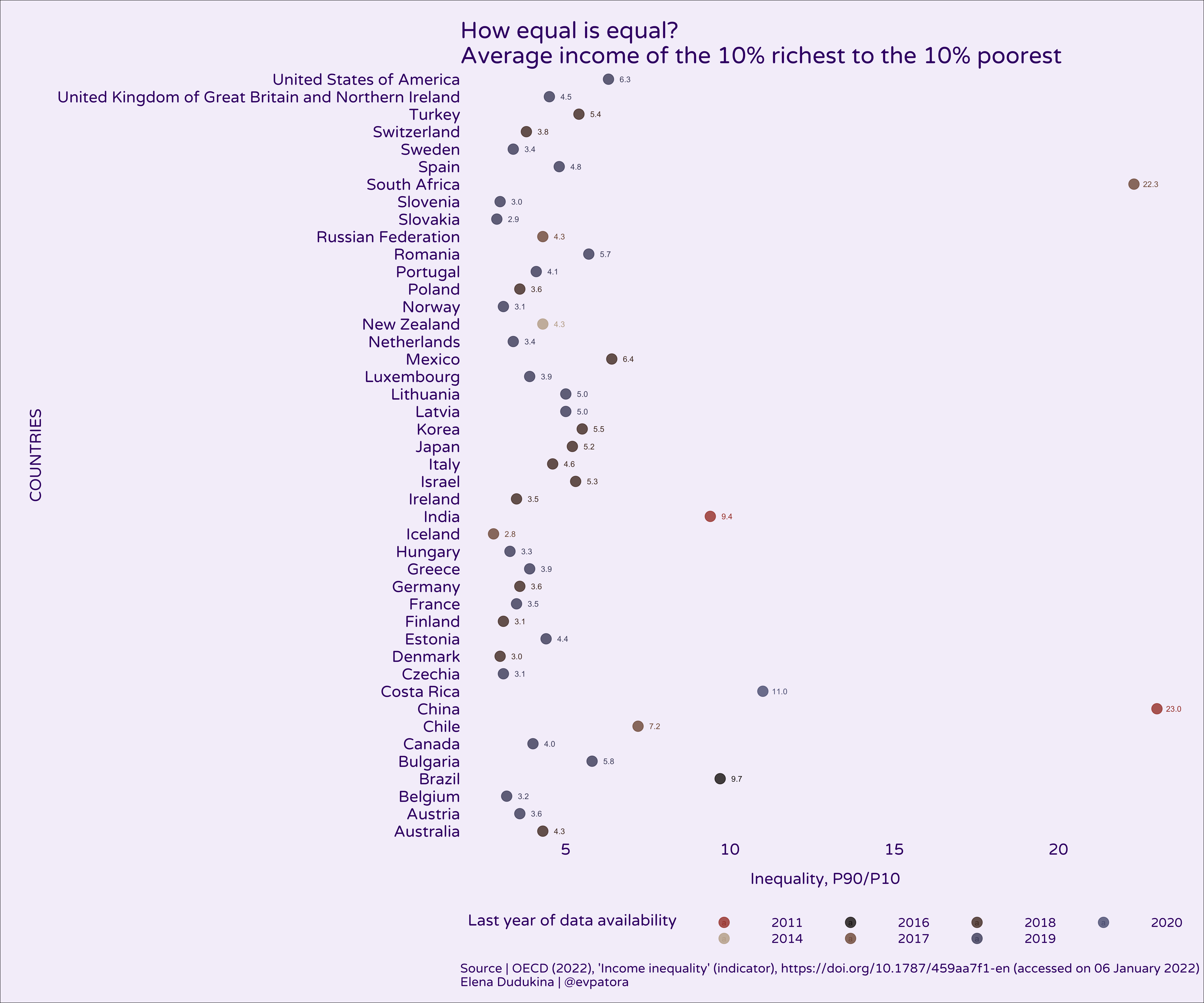
In most countries, the people in the highest 20% of income on average make 5-times the amount of money as poorest 20% of people. In China and South Africa income inequality between 20% richest and 20% poorest was high with ~30-times higher average income in 20% richest vs 20% poorest. The results are similar for the comparison of the average income among 10% richest vs 10% poorest people.
# P90/P10

p <- meta %>%
  filter(subject == "P90P10") %>%
  mutate(alpha_3 = fct_reorder(alpha_3, value)) %>%
  group_by(alpha_3) %>%
  arrange(time) %>%
  filter(
      row_number() == n()
  ) %>%
  ungroup() %>%
  ggplot(aes(x = country, y = value, color = as_factor(time), fill = as_factor(time))) +
  scale_y_continuous() +
  coord_flip() +
  geom_point(size = 5, alpha = 0.8) +
  theme_void(base_size = 17, base_family = "Varela Round") +
  theme(
    plot.background = element_rect(fill = "#F5F0FA"),
    text = element_text(color = "#3E0874"),
    axis.title.y = element_text(margin = margin(1, 1, 1, 1, unit = "lines"), color = "#3E0874", angle = 90),
    axis.title.x = element_text(margin = margin(1, 1, 1, 1, unit = "lines"), color = "#3E0874"),
    axis.text.y = element_text(color = "#3E0874", hjust = 1),
    axis.text.x = element_text(color = "#3E0874"),
    plot.title = element_text(size = 25),
    legend.position = "bottom",
    legend.key.width = unit(3, "cm"),
    legend.box.margin = margin(10, 10, 10, 10),
    panel.spacing = unit(5, "lines"),
    plot.margin = margin(15, 15, 15, 15),
    plot.caption = element_text(hjust = 0)
  ) +
  scale_color_manual(values = hermitage_palette(name = "madonna_litta")) +
  scale_fill_manual(values = hermitage_palette(name = "madonna_litta")) +
  labs(title = "How equal is equal?\nAverage income of the 10% richest to the 10% poorest", y = "Inequality, P90/P10",
       x = "COUNTRIES",
       caption = "Source | OECD (2022), 'Income inequality' (indicator), https://doi.org/10.1787/459aa7f1-en (accessed on 06 January 2022)\nElena Dudukina | @evpatora") +
  guides(color = guide_legend(title = "Last year of data availability", title.vjust = 1), fill = guide_legend(title = "Last year of data availability", title.vjust = 1)) +
  geom_text_repel(mapping = aes(label = format(value, digits = 2)), box.padding = 0.3, nudge_y = 0.5, nudge_x = 0, segment.linetype = 6, direction = "x", hjust = "right", size = 3)

p
References
- OECD (2022), “Income inequality” (indicator), https://doi.org/10.1787/459aa7f1-en (accessed on 06 January 2022).