TidyTuesday Starbucks Data
Data
The data I use are available here. Let’s go ✌
I have no initial idea what I want to present and so made several exploratory plots to see what I deal with.
library(tidyverse)
library(magrittr)
library(hermitage)
sb <- read_csv('https://raw.githubusercontent.com/rfordatascience/tidytuesday/master/data/2021/2021-12-21/starbucks.csv')
## Rows: 1147 Columns: 15
## ── Column specification ────────────────────────────────────────────────────────
## Delimiter: ","
## chr  (4): product_name, size, trans_fat_g, fiber_g
## dbl (11): milk, whip, serv_size_m_l, calories, total_fat_g, saturated_fat_g,...
##
## ℹ Use `spec()` to retrieve the full column specification for this data.
## ℹ Specify the column types or set `show_col_types = FALSE` to quiet this message.
sb %>% names(.)
##  [1] "product_name"    "size"            "milk"            "whip"
##  [5] "serv_size_m_l"   "calories"        "total_fat_g"     "saturated_fat_g"
##  [9] "trans_fat_g"     "cholesterol_mg"  "sodium_mg"       "total_carbs_g"
## [13] "fiber_g"         "sugar_g"         "caffeine_mg"
sb %>% skimr::skim(.)
Table: Table 1: Data summary
| Name | Piped data |
| Number of rows | 1147 |
| Number of columns | 15 |
| _______________________ | |
| Column type frequency: | |
| character | 4 |
| numeric | 11 |
| ________________________ | |
| Group variables | None |
Variable type: character
| skim_variable | n_missing | complete_rate | min | max | empty | n_unique | whitespace |
|---|---|---|---|---|---|---|---|
| product_name | 0 | 1 | 8 | 47 | 0 | 93 | 0 |
| size | 0 | 1 | 4 | 7 | 0 | 11 | 0 |
| trans_fat_g | 0 | 1 | 1 | 3 | 0 | 7 | 0 |
| fiber_g | 0 | 1 | 1 | 2 | 0 | 12 | 0 |
Variable type: numeric
| skim_variable | n_missing | complete_rate | mean | sd | p0 | p25 | p50 | p75 | p100 | hist |
|---|---|---|---|---|---|---|---|---|---|---|
| milk | 0 | 1 | 2.51 | 1.68 | 0 | 1.0 | 2.0 | 4 | 5 | ▇▃▃▃▃ |
| whip | 0 | 1 | 0.25 | 0.43 | 0 | 0.0 | 0.0 | 0 | 1 | ▇▁▁▁▂ |
| serv_size_m_l | 0 | 1 | 461.34 | 172.18 | 0 | 354.0 | 473.0 | 591 | 887 | ▁▇▆▆▁ |
| calories | 0 | 1 | 228.39 | 137.67 | 0 | 130.0 | 220.0 | 320 | 640 | ▆▇▆▃▁ |
| total_fat_g | 0 | 1 | 6.19 | 5.97 | 0 | 1.0 | 4.5 | 10 | 28 | ▇▃▂▁▁ |
| saturated_fat_g | 0 | 1 | 3.88 | 4.01 | 0 | 0.2 | 2.5 | 7 | 20 | ▇▃▂▁▁ |
| cholesterol_mg | 0 | 1 | 15.24 | 17.97 | 0 | 0.0 | 5.0 | 30 | 75 | ▇▂▂▁▁ |
| sodium_mg | 0 | 1 | 139.65 | 93.09 | 0 | 70.0 | 135.0 | 200 | 370 | ▇▇▇▃▂ |
| total_carbs_g | 0 | 1 | 37.72 | 23.26 | 0 | 20.0 | 37.0 | 53 | 96 | ▇▇▇▅▂ |
| sugar_g | 0 | 1 | 34.99 | 22.46 | 0 | 18.0 | 34.0 | 49 | 89 | ▇▇▇▅▂ |
| caffeine_mg | 0 | 1 | 91.86 | 78.11 | 0 | 30.0 | 75.0 | 150 | 475 | ▇▃▁▁▁ |
Exploratory plots
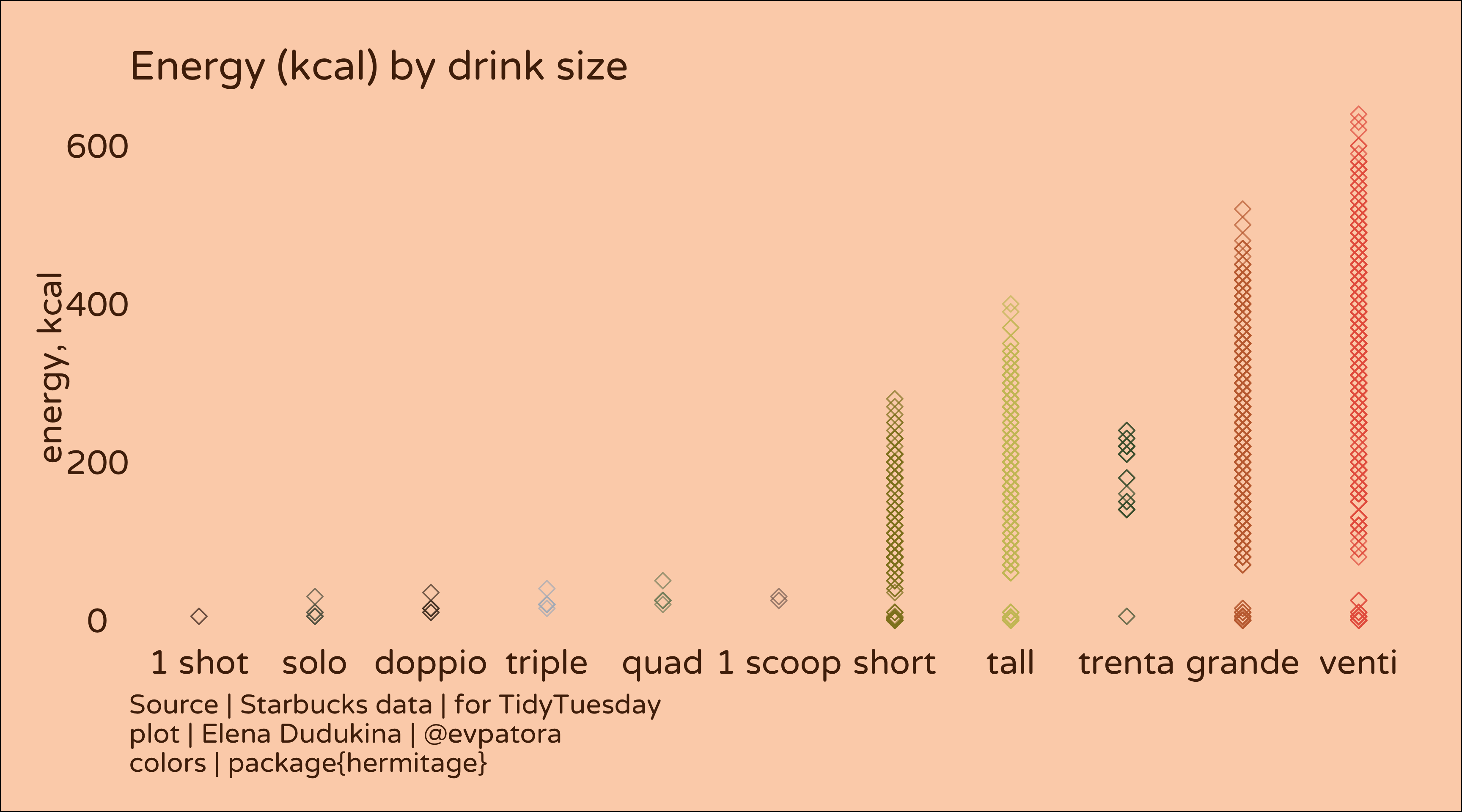
# calories by drink size
sb %>%
  mutate(
    size = factor(size),
    size = fct_reorder(size, calories),
    alpha = scales::rescale(calories, to = 0, 1)
  ) %>%
ggplot(aes(x = size, y = calories, color = size)) +
  geom_point(size = 2, alpha = 0.7, shape = 5) +
  theme_void(base_size = 15, base_family = "Varela Round") +
  theme(
    plot.background = element_rect(fill = "#FCD3B7"),
    text = element_text(color = "#50270A"),
    axis.title.y = element_text(color = "#50270A", angle = 90),
    axis.text.y = element_text(color = "#50270A"),
    legend.position = "none",
    legend.box.margin = margin(2, 2, 2, 2),
    axis.text.x = element_text(color = "#50270A"),
    panel.spacing = unit(5, "lines"),
    plot.margin = margin(15, 15, 15, 15),
    plot.caption = element_text(hjust = 0)
  ) +
  scale_color_manual(values = hermitage_palette("cottages_vincent")) +
  labs(title = "Energy (kcal) by drink size", y = "energy, kcal",
       caption = "Source | Starbucks data | for TidyTuesday\nplot | Elena Dudukina | @evpatora\ncolors | package{hermitage}")
# calories by drink size and sugar
sb %>%
  mutate(
    size = factor(size),
    size = fct_reorder(size, calories)
  ) %>%
  filter(calories > 200)  %>%
  ggplot(aes(x = sugar_g, y = total_fat_g, color = size)) +
  geom_point(size = 2, alpha = 0.9, shape = 5) +
  facet_wrap(~size) +
  theme_void(base_size = 13, base_family = "Varela Round") +
  theme(
    plot.background = element_rect(fill = "#FCD3B7"),
    text = element_text(color = "#50270A"),
    axis.title.y = element_text(color = "#50270A", angle = 90),
    axis.title.x = element_text(color = "#50270A"),
    axis.text.y = element_text(color = "#50270A"),
    axis.text.x = element_text(color = "#50270A"),
    legend.position = "none",
    legend.box.margin = margin(2, 2, 2, 2),
    panel.spacing = unit(5, "lines"),
    plot.margin = margin(15, 15, 15, 15),
    plot.caption = element_text(hjust = 0)
  ) +
  scale_color_manual(values = hermitage_palette("cottages_vincent")) +
  labs(title = "Energy (kcal) by drink total fat (g) and sugar (g) added", y = "total fat, g", x = "sugar, g",
       caption = "Source | Starbucks data | for TidyTuesday\nplot | Elena Dudukina | @evpatora\ncolors | package{hermitage}")
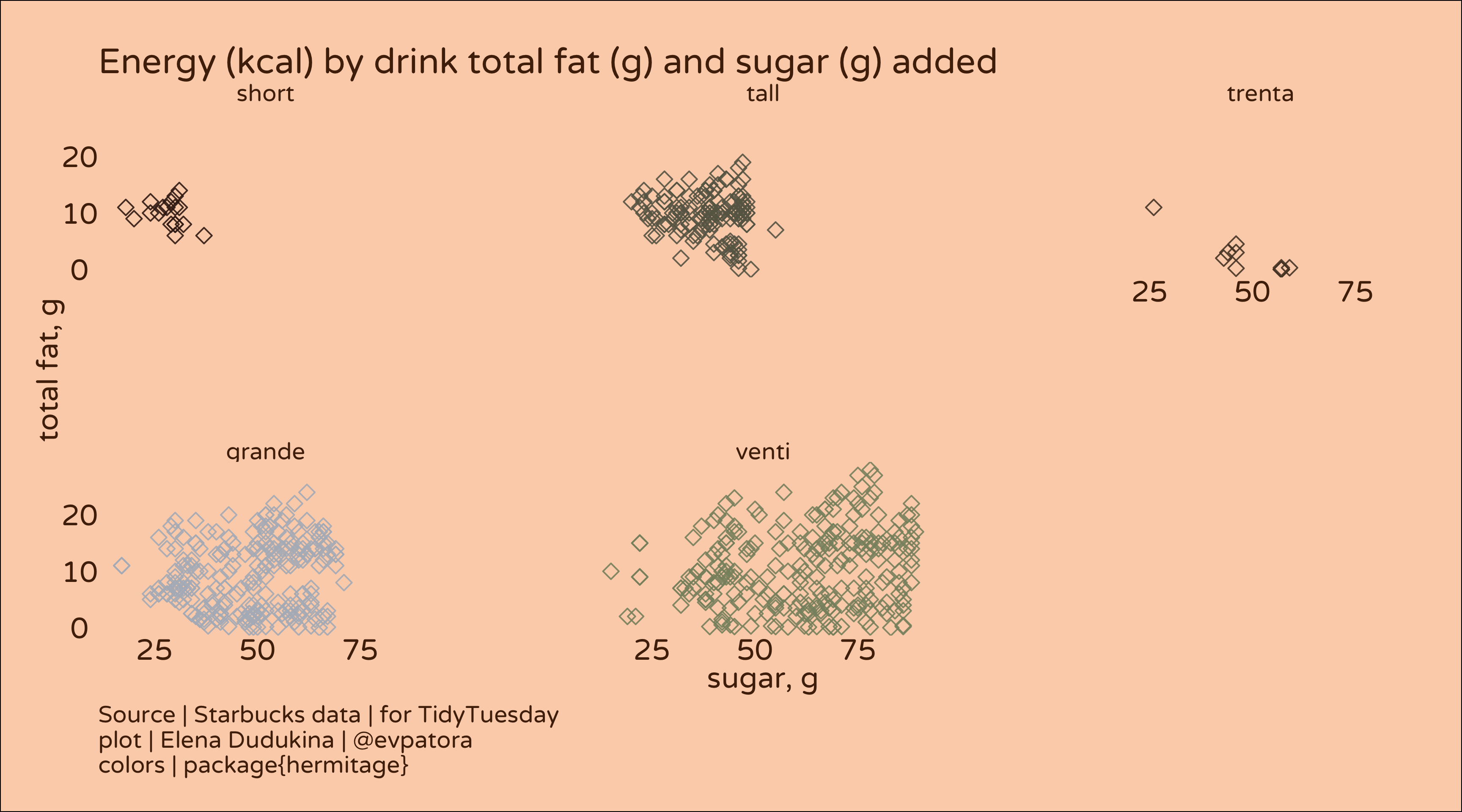
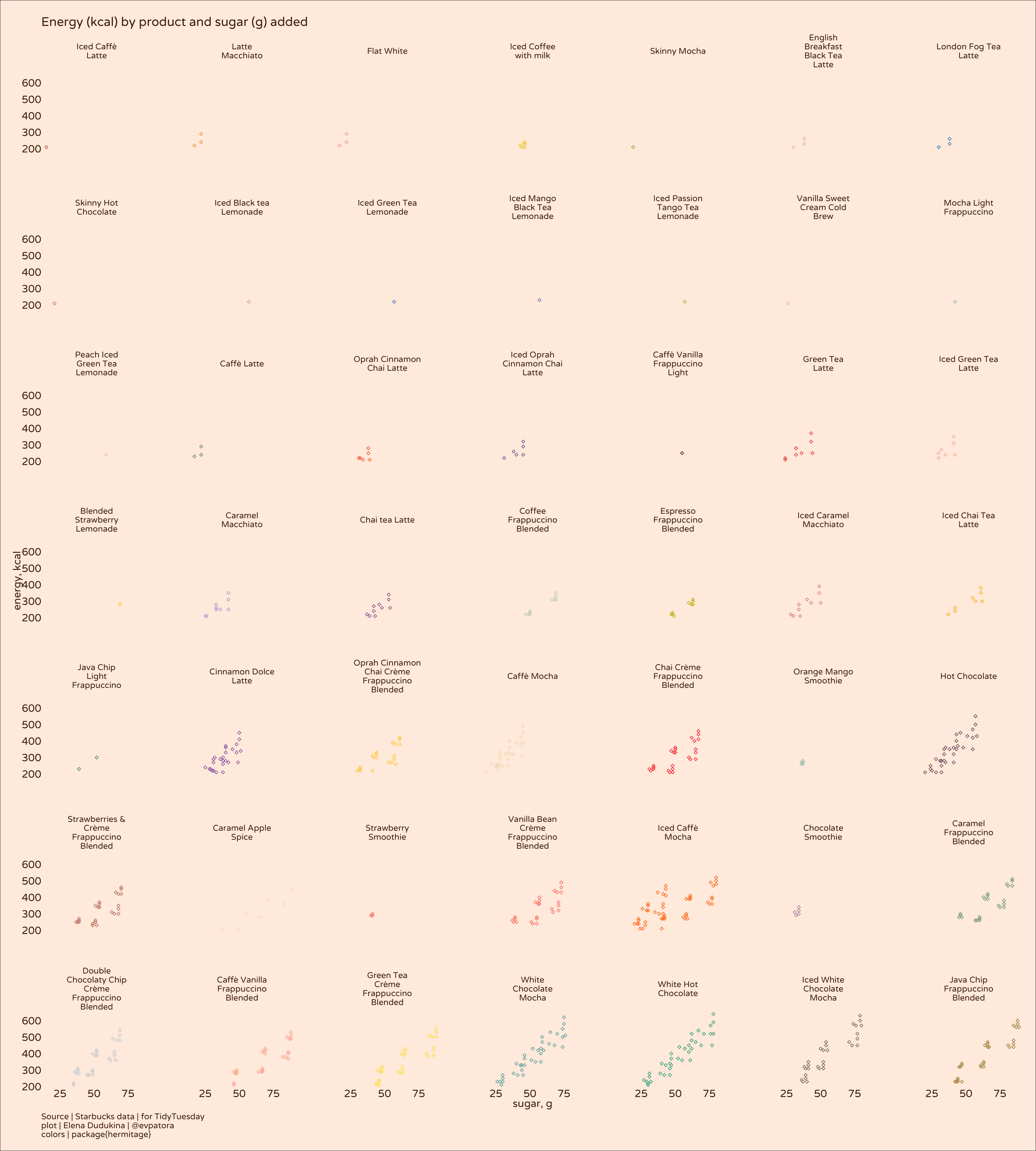
Another exploratory graph.
# calories by product and sugar for beverages with > 200 kcal
sb %>%
  mutate(
    product_name = factor(product_name),
    product_name = fct_reorder(product_name, calories)
  ) %>%
  filter(calories > 200)  %>%
  ggplot(aes(x = sugar_g, y = calories, color = product_name)) +
  geom_point(size = 1, shape = 5) +
  facet_wrap(~product_name, labeller = label_wrap_gen(15)) +
  theme_void(base_size = 13, base_family = "Varela Round") +
  theme(
    plot.background = element_rect(fill = "#FFEDE1"),
    text = element_text(color = "#50270A"),
    axis.title.y = element_text(color = "#50270A", angle = 90),
    axis.title.x = element_text(color = "#50270A"),
    axis.text.y = element_text(color = "#50270A"),
    legend.position = "none",
    axis.text.x = element_text(color = "#50270A"),
    panel.spacing = unit(3, "lines"),
    plot.margin = margin(15, 15, 15, 15),
    plot.caption = element_text(hjust = 0)
  ) +
  scale_color_manual(values = hermitage_palette("parsons_2")) +
  labs(title = "Energy (kcal) by product and sugar (g) added", y = "energy, kcal", x = "sugar, g",
       caption = "Source | Starbucks data | for TidyTuesday\nplot | Elena Dudukina | @evpatora\ncolors | package{hermitage}")
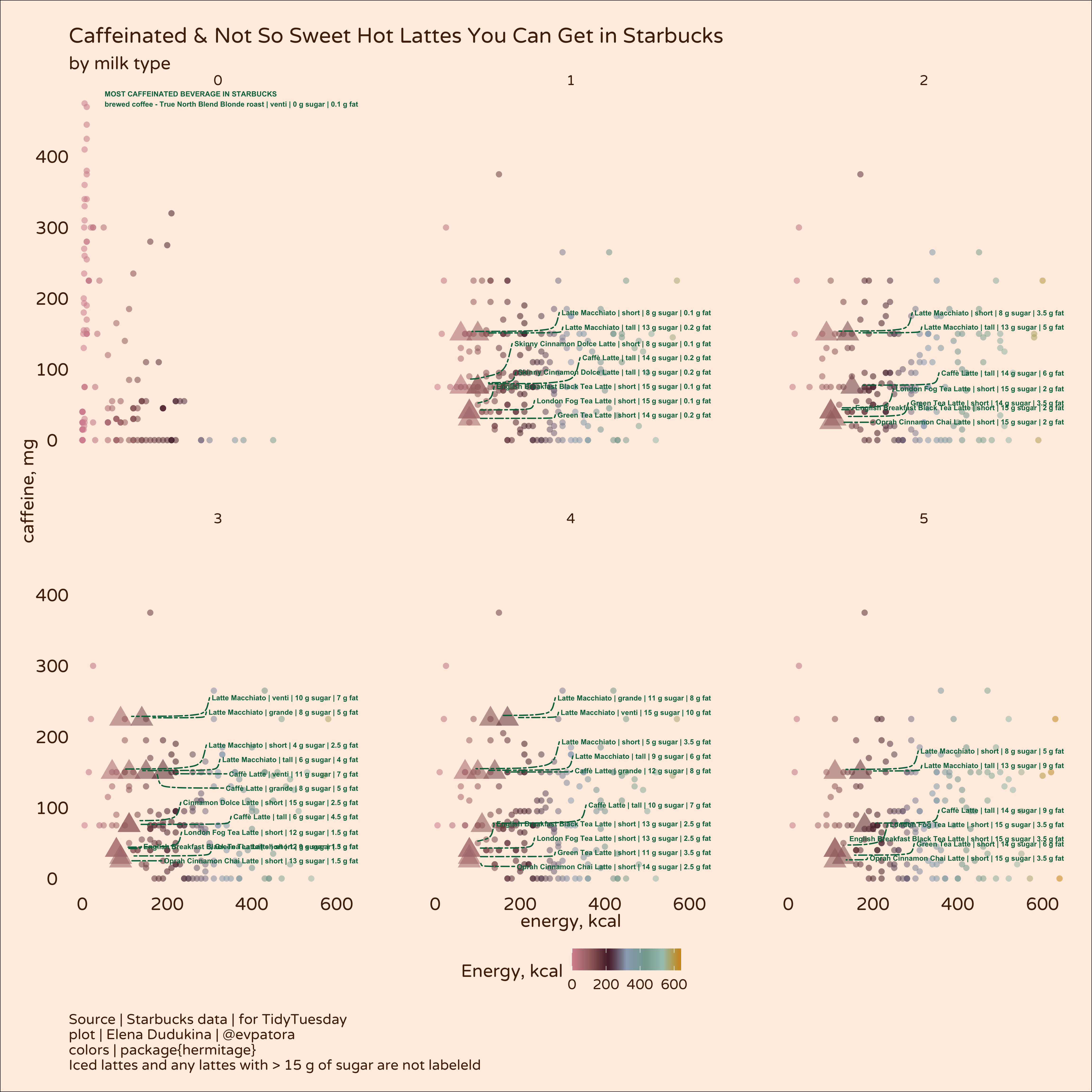
It should come as no surprise that amount and type of milk, amount of sugar and the beverage size determine the overall kcal content in the cup. Why not leverage the power of ggplot to make a graph that tells me what kinds of hot lattes I can get given that I want maximum amount of caffeine and minimum amount of sugar because this is how I like my lattes. In winter season, iced coffee is a deal-breaker and > 15 g sugar per beverage is also a deal-breaker. Don’t worry, I will compensate for that with having more cookies 🍪
Final graph
# most caffeinated and not so sweet hot lattes

sb_caf_rank <- sb %>%
  mutate(
    product_name = fct_reorder(product_name, caffeine_mg)
  ) %>%
  group_by(product_name, milk, calories) %>%
  arrange(caffeine_mg) %>%
  mutate(
    label = case_when(
      str_detect(product_name, "Iced") ~ NA_character_,
      sugar_g > 15 ~ NA_character_,
      caffeine_mg == max(caffeine_mg) & calories == min(calories) & sugar_g <= 15 & str_detect(product_name, "Iced", negate = T) & str_detect(product_name, "Latte") ~ paste0(product_name, " | ", size, " | ", sugar_g, " g sugar | ", total_fat_g, " g fat"),
      T ~ NA_character_
    ),
    point = case_when(
      !is.na(label) ~ "4",
      T ~ "3"
    )
  ) %>%
  ungroup()  %>%
  mutate(label = case_when(
    caffeine_mg == max(caffeine_mg) ~ paste0("MOST CAFFEINATED BEVERAGE IN STARBUCKS\n", product_name, " | ", size, " | ", sugar_g, " g sugar | ", total_fat_g, " g fat"),
    T ~ label
  ))

sb_plot <- sb_caf_rank  %>%
  ggplot(aes(x = calories, y = caffeine_mg, color = calories, fill = calories)) +
  geom_point(aes(shape = point, size = point), alpha = 0.55) +
  facet_wrap(~milk) +
  theme_void(base_size = 14, base_family = "Varela Round") +
  theme(
    plot.background = element_rect(fill = "#FFEDE1"),
    text = element_text(color = "#50270A"),
    axis.title.y = element_text(color = "#50270A", angle = 90),
    axis.title.x = element_text(color = "#50270A"),
    axis.text.y = element_text(color = "#50270A"),
    axis.text.x = element_text(color = "#50270A"),
    legend.position = "bottom",
    legend.margin = margin(10, 10, 10, 10),
    panel.spacing = unit(3, "lines"),
    plot.margin = margin(15, 15, 15, 15),
    plot.caption = element_text(hjust = 0)
  ) +
  ggrepel::geom_text_repel(mapping = aes(label = label), color = "#00704A", segment.curvature = -0.6,
                           nudge_x = 500, nudge_y = 20, point.size = 10, fontface = "bold",
                           segment.linetype = 6, direction = "y", hjust = "left", size = 2) +
  scale_color_gradientn(colours = hermitage_palette("faberge", "continuous", n = 71)) +
  scale_fill_gradientn(colours = hermitage_palette("faberge", "continuous", n = 71)) +
  guides(color = "none", shape = "none", size = "none", fill = guide_colorbar(title = "Energy, kcal")) +
  labs(title = "Caffeinated & Not So Sweet Hot Lattes You Can Get in Starbucks",
       subtitle = "by milk type",
       y = "caffeine, mg", x = "energy, kcal",
       caption = "Source | Starbucks data | for TidyTuesday\nplot | Elena Dudukina | @evpatora\ncolors | package{hermitage}\nIced lattes and any lattes with > 15 g of sugar are not labeleld")

sb_plot
## Warning: Using size for a discrete variable is not advised.
## Warning: Removed 1102 rows containing missing values (geom_text_repel).
ggsave(sb_plot, filename = "starbucks.jpeg", dpi = 400, units = "cm", width = 30, height = 31, path = path)
## Warning: Using size for a discrete variable is not advised.
## Warning: Removed 1102 rows containing missing values (geom_text_repel).